Tide Mobile 3.0: Redefine how college students gather information and have fun, accessible for everyone in one touch
Project
2016-17
Client + Team
Student Portal, ZJU→
Bubu, Jingjing, Shiguan
Tide Mobile 3.0 (求是潮手机站) is an everyday calendar app for university students to organize their academic calendar and find more club activities in leisure life.
Check it out on App Store→.
My Role:
As a team leader, I engaged the team forward in an open atmosphere. I made user research and design critique on the previous version of Tide Mobile to come up with ideas about the new version. As a team, we made the design desicions together during discovering and making the ia, wireframes, interactions and later developing.
Download the PDF version →
Due to agile updates, the images below from different periods may look a little bit different.
overview
Tide Mobile 3 is born to improve productivity in school. By saving students' time and energy to organize all the information they need, we finally brought them a new school lifestyle.
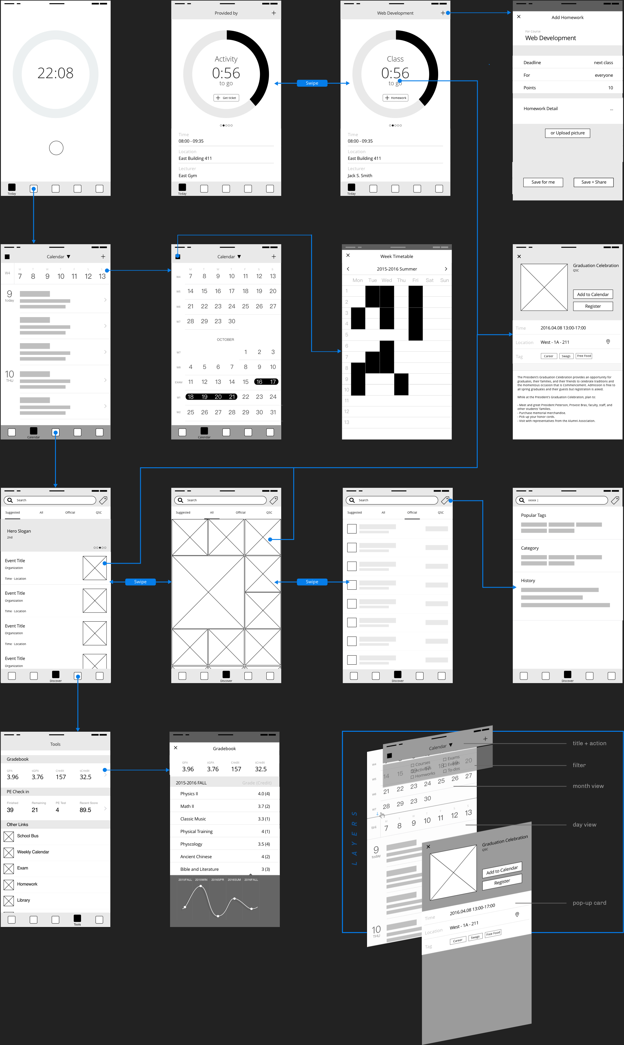
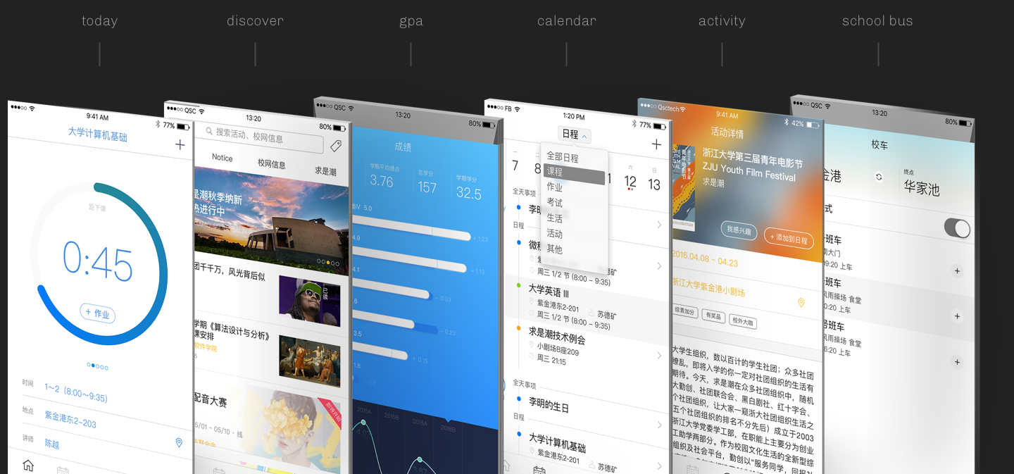
Today - Designed for 'this' moment. With one glance, users can know the ongoing event, and following events coming up today.
Calendar - All the events are synced from the educational system or our database so the user's schedule is always up-to-date.
Discover - A place with lots of fun activities posted by hundreds of clubs. View activities. Check availability. Book tickets online. And add to the calendar with one click.
Tools - Check some popular tools and links - your physical training, GPA, the school bus, mail...
key problems
Before, life in my school wasn't easy and fun because of some major issues.
Isolated useful resources
Students waste lots of time on checking plenty of information including courses, exams, homework, labs, financial aids and school bus from several places. It spends time, but students don't want to miss things.
Information overload
Students also get information passively outside their academic life from tons of posters, paper ads, outdoor banners or SMS/email sent by departments and student clubs. But those ways are not attractive for students, also imprecise and expensive for the sender.
Tide Mobile 2.0 can't fulfill the changing user needs
Tide Mobile's old version designed by Ruolan Xia→ was published in 2014. Cards with different information showed on the Home screen and users can click cards to see more and do actions. However, students are having increasing negative feedback on this app.
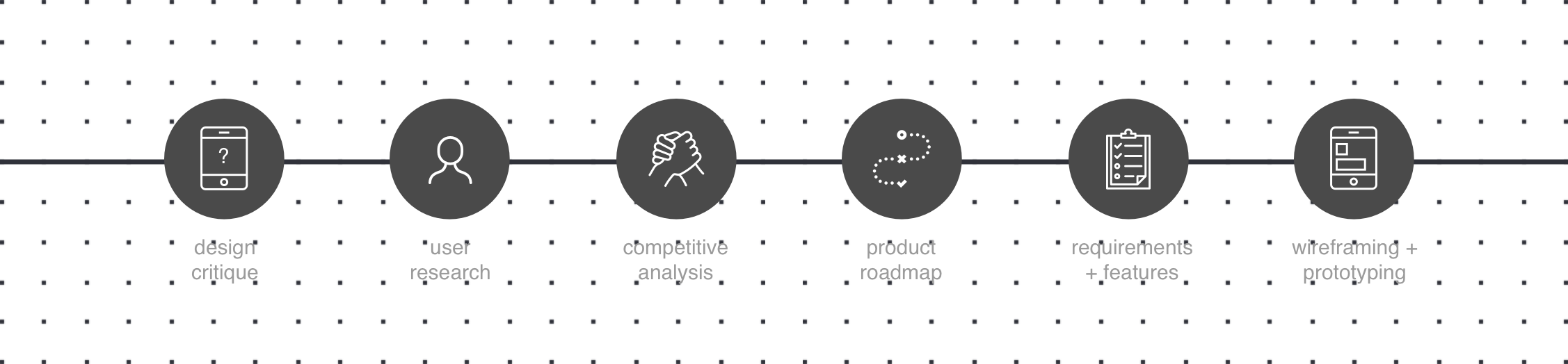
design critique + research
We started from design critique on the previous version 2.0 base on our user research. We also conducted interviews on peers, senoirs and freshmen.

Conclusion: a new information structure needed
Although the previous design created a unique (fancy!) experience by cards view, some interactions are still hard to understand. The card didn't work as we thought because the needed information is not shown enough while useless details showed a lot.
We also noticed the big differences in how user use it depending on when and where. In different scenarios, users want to focus on only a few things without noises.
design thinking
Our goal is to redefine the easy and joyful experience on Tide Mobile. "Easy" is designing for situations and tasks to let users gather information quickly and "Joyful" is a sense of surprise.
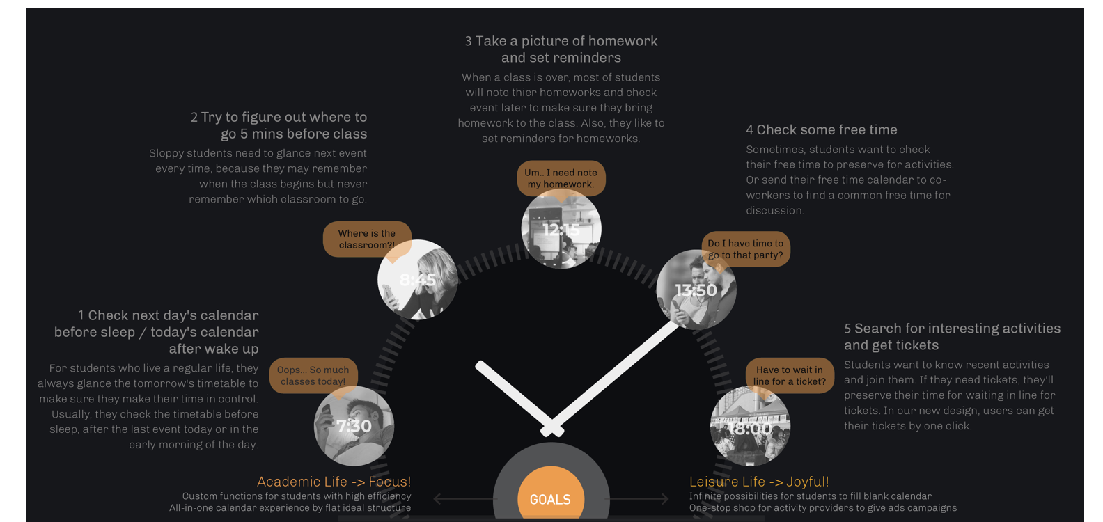
In our consideration, the most important information for one situation should be specially designed to support users to finish related tasks quickly. Users don't want everything. They just want one thing at a time.
For instance, when users want to check the timetable on the bed or before sleep, they wish to a full calendar for a day. While an anxious boy standing near a building touching his phone, he wants to know only the classroom number where he should be in there in 30 sec.
To increase productivity, we double-checked our existing IA to see the current workflows and resources.
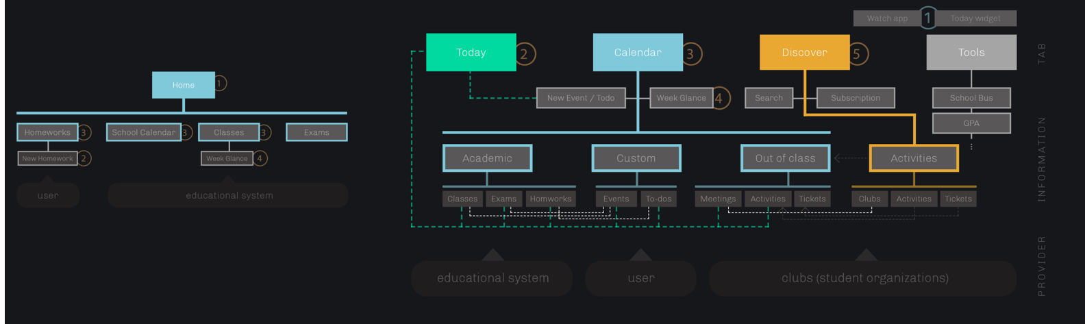
Scenario-based design provide an extreme clear IA where useful information can be accessible in a fewer level.
We reorganize the information architecture to make sure elements have the right priority, so users can get them in easier.
after release
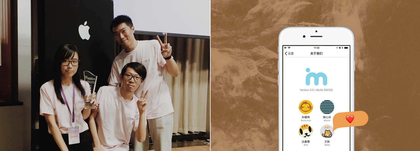
Till Oct. 2016, Tide Mobile has more than 18,000 daily active users. We feel very proud to help almost 61% undergraduate student at Zhejiang University to have an easy and joyful life. Don't forget to check out cool ad→.
rethink in 2019
Positive feedback.
Users mostly like the changes.
After 2017, I left the project team due to graduation. We did some design iterations during the years. And students were already live in a lifestyle with Tide Mobile. I also grew up and gain more abilities in design and coding, thanks to my team.
Our project also had a big impact out of school. My teammates and I got the Second Prize in China Collegiate Computing Contest Mobile Application Innovation Contest by Apple and MOE China in 2016. I felt so proud that my name is on the about page in every Tide Mobile.
Should have more testing.
Can think bigger.
We always wanted to chase perfection, in the right path. At that time, we didn't keep conducting user tests and validating our big decision. We did some design decisions (for example, the main clue for Tide Mobile - time? location? social?), but only supported by typical user data. We did some quick workflow analysis after but judged by our own minds. Those can't reflect users' mind and our minds were limited to think bigger.
Unique design language lost.
It somehow became common.
For a pure experience, we started from zero. As a team leader, when you decide to start over, everyone is actually facing a big pressure. We didn't have enough time to inheritance from our own style. Also, a big change from card view to tab view improve the efficiency, but somehow users feel the emotional bond was missing.