Alipay: Learned from designing mobile payments and city service in Ant Finiancial
Internship
2018
Company + Team
Ant Financial→
Alipay App→
K.P. Wang - Mentor
Huajing Jin - Supervisor
Mobile payments in the city service era - what I learned from working for Alipay in Ant Financial, the highest valued TechFin company in the world.
In the 2018 summer, I spent a wonderful time in Ant Financial (Alibaba). I was lucky to work in Alipay Design team with talented colleagues together to bring more ideas to come true. During my internship, I worked on developing two new projects and improving one launched project.
My Role:
Create design concepts, IA, user flows, wireframe, and also prototypes.
Work with government, researchers, and developers to launch the project and establish evaluation methods.
Spend my free time working on motion design and usability testing on a cross-device prototype.
Due to NDA, I can't reveal all my work details.
Project one
Social Insurance Payment Platform: worked with senoir designers, developers, governments, and other teams, we launched this project at August 2018. Citizens in several cities to register their social insurance and pay the bills online - no need to wait in line or talk with agencies.
Entrance - Citizens can register and change their insurance plan in the app by several clicks.

Business dashboard - Insurance managers can host a group of people profile online, and pay for their insurance.

Scan to pay - If users receive an overdate bill, they can simply scan the barcode to check billing detail and pay online.
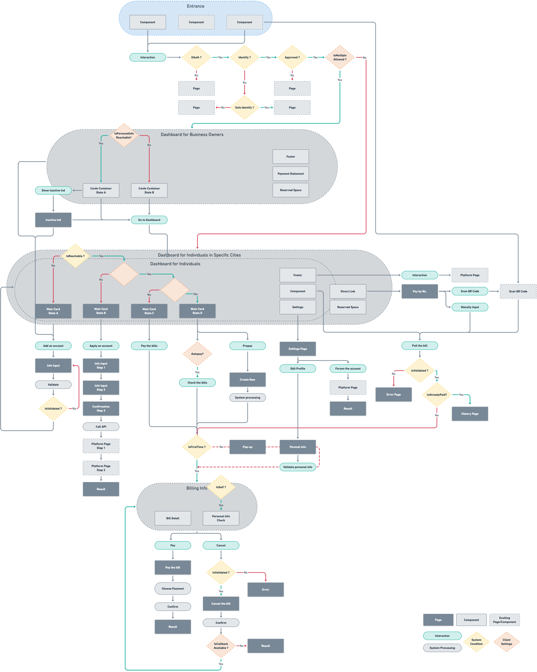
The final version workflow diagram showing all components we use and reuse, and all details about parameters in designs. This diagram benefits the communication between designer and developer, and another platform team.
Since the work flow chart covers all the pages and components, it's easy for future usage - when another city use this feature with unique needs, developers only need to set some parameters for current interface and add some single pages.
Powered by Whimsical→ .
Other Projects
Using my work time and free time, I also worked on brainstorming new ideas and some motion designs. Powered by Framer Studio→ and Lottie→.

Lab: a hidden space for new features. The new design allow users to access the lab quickly without taking a bigger space in the interface.

Receive gift in chats: a motion design for opening the surprise gift.

Message center: a new way to preview unread messages. User can click on icons in the dock to locate it immediately. Patented by Ant Finiancial and me.
What I learned,
experienced, and experimented
Think broader and broader
for the user spectrum
Design for both key user cases and lost of edge cases from more than 300,000+ users. Think how user access the new product/service and how it can take advantage of the existing resources - created the user spectrum for wider possibilities, even for potential users who can only see a poster with a QR code. Because to transfer current users or poster ad receivers to the new product/service easier is also an important design goal.
Give me a fulcrum
and I will convince the stakeholders
The fulcrum is design decisions driven by research, company culture or big data. We are not convincing ourselves and be a fancy guy on Dribbble. Instead, we are facing huge external resistance - from clients and different developer teams (project team, API team, security team in one project maybe!). I learned to make the right design decisions and use it to convince other people - how our design goals can inheritance from business goals, how we will track the design quality, how many potential users one feature is facing, etc. Sometimes, to finish a convincing draft efficiently with stakeholders is way more important than keeping your sketch file not dirty.
Breakthrough the mindset
and chase for excellence
"If you work in a textbook style, you may never reach excellence in a limited time". - my mentor
It's necessary to always be creative and not be limited by tools. I worked on flexible card prototyping for complex IA designs, paper prototyping for motion designs, and made developer-must-love-it pseudo-algorithm flowcharts for an institution solution project. You know what... they loved it!
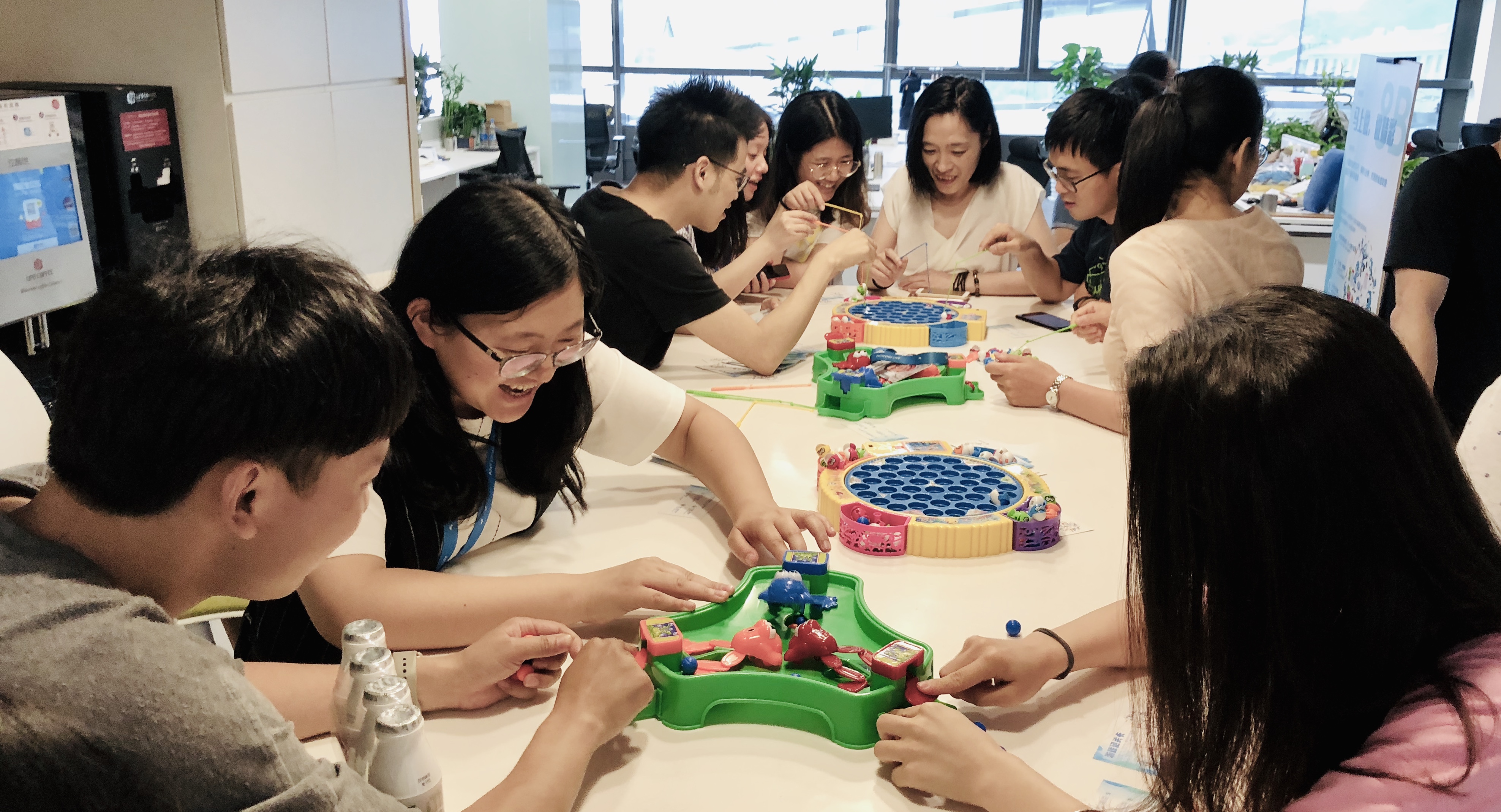
Lastly, a memory of us celebrating Chilren's Day lol.
If you want more details about my internship experience, please contact me and I am happy to share!
this is the first selected project
next selected project
Tide Mobile 3.0 →